

In the realm of interior design, colors are more than mere aesthetic choices they are powerful tools that shape our perception of spaces. One key principle that designers leverage to create visually stunning and harmonious environments is chromatic coordination. This article explores the nuances of chromatic coordination in interior design, delving into its definition, significance, and practical applications.
Understanding Chromatic Coordination
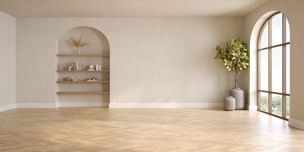
Chromatic coordination is the deliberate selection and arrangement of colors within a space to achieve a harmonious and unified design. It goes beyond the individual colors themselves, focusing on their interactions and the overall impact on the atmosphere. By understanding the basics of color theory and psychology, designers can create environments that evoke specific emotions and enhance the overall experience of the space.
The Role of Chromatic Coordination in Interior Design
In interior design, color schemes play a pivotal role in establishing the desired theme or mood of a space. Chromatic coordination becomes a guiding principle, ensuring that colors work together seamlessly. Whether it’s a modern and minimalistic design or a more traditional and eclectic approach, effective color coordination sets the foundation for a cohesive and visually appealing interior.
To illustrate, consider a modern living room where a palette of cool blues and greens creates a serene and sophisticated atmosphere. Contrastingly, a vibrant and eclectic kitchen may employ warm tones like reds and yellows to infuse energy and personality into the space. The key lies in understanding the purpose of the space and selecting colors that align with that purpose.
Creating Visual Flow and Harmony
Chromatic coordination extends beyond individual rooms, contributing to the visual flow and harmony of an entire living space. Thoughtful color transitions between rooms, strategic use of accent colors, and the creation of focal points contribute to an overall sense of unity. This cohesion enhances the aesthetic appeal and ensures that the design tells a seamless visual story.
For example, a gradual transition from neutral tones in a hallway to a bolder color scheme in the adjoining living room can create a sense of progression and connectivity. Similarly, using accent colors sparingly but strategically can draw attention to specific design elements, adding depth and interest to the overall composition.
Chromatic Coordination for Different Spaces
The application of chromatic coordination varies based on the function and characteristics of different spaces within a home or commercial setting. Bedrooms may benefit from calming and soothing color palettes, such as soft blues and neutrals, to promote relaxation. On the other hand, vibrant and energetic colors like yellows and oranges may be suitable for communal spaces like living rooms or kitchens.
Versatility is a key advantage of chromatic coordination, allowing designers to adapt color schemes to meet both functional and aesthetic needs. This adaptability ensures that the coordinated colors not only enhance the visual appeal of a space but also contribute to its intended purpose.
Trends and Innovations in Chromatic Coordination
As with any design concept, chromatic coordination is subject to trends and innovations. Currently, there is a growing emphasis on biophilic design, where natural color palettes inspired by the outdoors are integrated into interiors. Additionally, advancements in technology have led to innovative lighting solutions that can dynamically alter the perception of color in a space, providing designers with new tools for creative expression.

Conclusion
Chromatic coordination stands as an indispensable aspect of interior design, offering a framework for creating spaces that are not only visually captivating but also deeply resonant with the intended emotions and functions. By understanding the principles of color coordination, designers can elevate the aesthetic appeal and overall experience of any interior.
Frequently Asked Questions (FAQs):
1. Can chromatic coordination work for small spaces, or is it more suitable for larger areas?
Chromatic coordination is versatile and can be applied to spaces of any size. For smaller spaces, consider lighter color schemes to create an illusion of openness, while strategically placed accents can add character.
2. How do I choose a color scheme that aligns with the purpose of a room?
Consider the function of the space and the emotions you want to evoke. Calming colors like blues and greens are suitable for bedrooms, while vibrant tones like reds and yellows can add energy to communal areas like living rooms.
3. Are there specific color combinations that always work well together?
Certain classic combinations, such as complementary or analogous colors, are generally harmonious. However, the success of a combination depends on factors like lighting, room size, and the overall design theme.
4. Can chromatic coordination be applied to commercial spaces like offices or retail stores?
Absolutely. Chromatic coordination is equally relevant in commercial design. Consider the desired atmosphere for the space and choose colors that align with the brand image and the needs of the occupants or customers.
5. Are there any rules for using accent colors in chromatic coordination?
While there are no strict rules, using accents sparingly and strategically is advisable. Accent colors can draw attention to specific features or elements, adding interest without overwhelming the overall design.
6. How can I stay updated on the latest trends in chromatic coordination in interior design?
To stay informed about the latest trends, follow reputable interior design publications, attend design events and exhibitions, and explore online platforms where designers share their work and insights.