
In the world of branding, the power of colors to influence consumer perception and behavior is unparalleled. The strategic use of color psychology goes beyond creating visually appealing designs it shapes brand identity and fosters memorable connections with consumers. This article explores the profound impact of color psychology on branding success, with a specific focus on the strategic application of chromatic coordination in interior design.
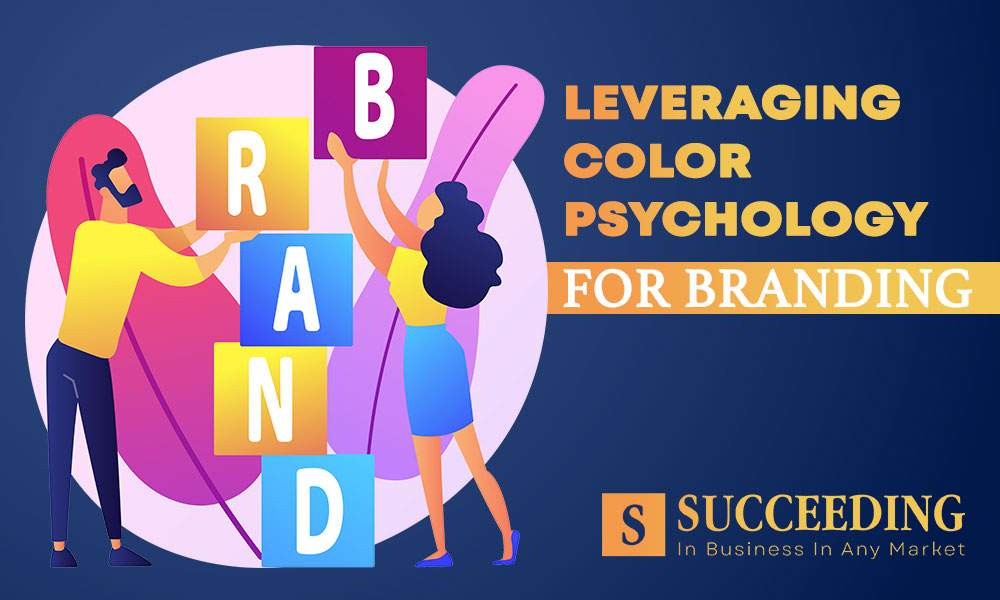
The Power of Color in Branding
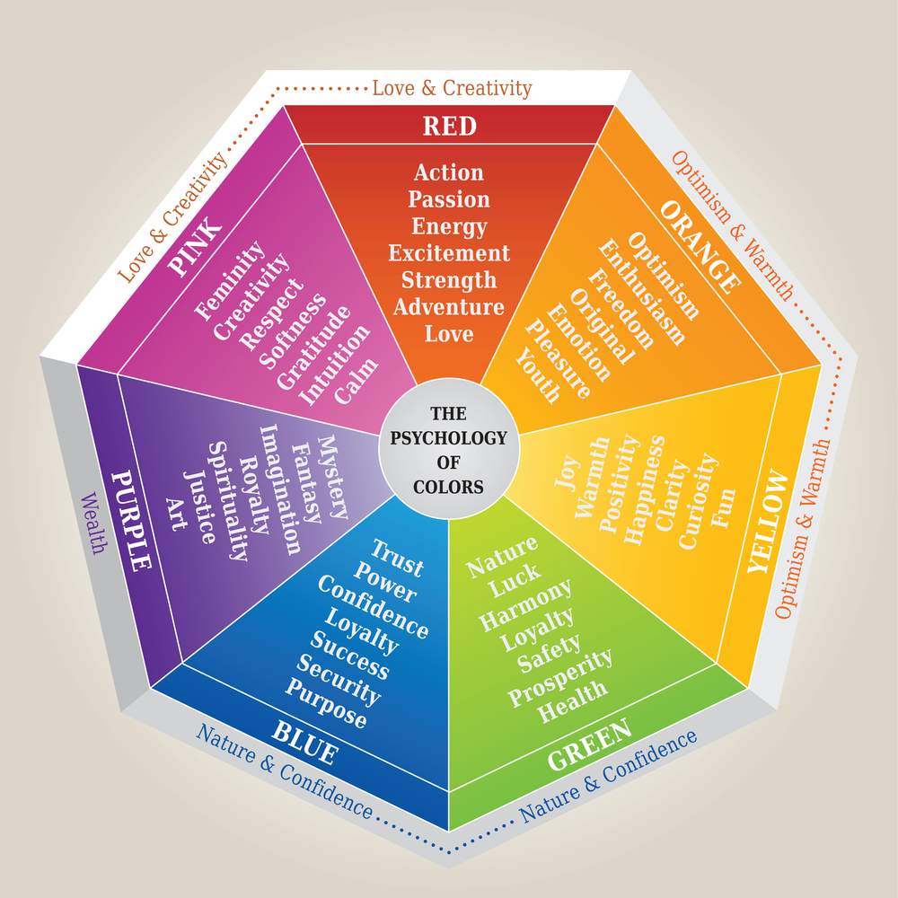
Color is a silent yet potent communicator that speaks to our emotions, influences our decisions, and leaves lasting impressions. The psychology of color is a well-established field, revealing how different hues can evoke specific feelings and associations. Brands harness this power by carefully selecting colors that align with their messaging and values. Warm tones like reds and yellows may convey energy and excitement, while cooler blues and greens evoke calmness and trust.
Introduction to Chromatic Coordination in Interior Design
Chromatic coordination, the deliberate selection and arrangement of colors, plays a pivotal role in interior design. This extends beyond mere aesthetics; it is a strategic tool that influences the overall atmosphere of a space. In the context of branding, chromatic coordination becomes a bridge between the visual identity established through logos and advertisements and the physical manifestation of that identity in interior spaces.
The Connection Between Branding and Interior Design
Brands are recognizing the seamless connection between their visual identity and the physical spaces they occupy. Interior design becomes an extension of branding, providing an opportunity to immerse consumers in a cohesive brand experience. From retail stores to corporate offices, the application of a brand’s color palette in interior design creates a unified and recognizable environment that reinforces brand identity.
Chromatic Coordination Strategies for Branding Success
Strategic chromatic coordination involves more than replicating a brand’s color palette within interior spaces. It requires a nuanced understanding of how colors interact and the emotions they evoke. Consistency is key; maintaining a cohesive color scheme across various touchpoints, including signage, packaging, and interior design elements, reinforces brand recognition and strengthens the overall brand narrative.
Case Studies of Successful Branding through Chromatic Coordination
Case Study 1: Apple

- Apple’s minimalist and clean design philosophy extends seamlessly from its product design to its retail spaces. The use of neutral tones and sleek lines creates an environment that mirrors the brand’s commitment to simplicity and innovation.
Case Study 2: Starbucks
- Starbucks incorporates its iconic green and white color scheme not only in its logo and packaging but also in the interior design of its cafes. The earthy tones and warm lighting create a cozy and inviting atmosphere, aligning with the brand’s emphasis on community and comfort.
Case Study 3: Coca-Cola

- Coca-Cola’s bold red and white color scheme is synonymous with its brand. In its marketing materials, product packaging, and even interior design in promotional events, the consistent use of these colors reinforces the brand’s energy, excitement, and heritage.
Overcoming Challenges in Chromatic Coordination for Branding
While chromatic coordination is a powerful branding tool, challenges may arise, especially in a global market with diverse cultural preferences. Brands need to navigate these challenges by conducting thorough research and remaining flexible in their approach. Additionally, staying attuned to evolving design trends without compromising the core brand identity is essential.

Conclusion
In the dynamic landscape of branding, where every visual element contributes to the narrative, the strategic use of chromatic coordination emerges as a cornerstone for success. As businesses embrace the fusion of color psychology and interior design, they not only create visually stunning spaces but also cultivate a powerful and memorable brand presence.
Frequently Asked Questions (FAQs):
1. How does color psychology influence consumer behavior in branding?
Color psychology suggests that different colors evoke specific emotions and associations. Brands leverage this knowledge to create connections with consumers by choosing colors that align with their messaging and values.
2. What is chromatic coordination, and how does it relate to interior design in branding?
Chromatic coordination is the intentional selection and arrangement of colors. In branding, it extends to interior design, ensuring that a brand’s color palette is seamlessly integrated into physical spaces, creating a cohesive and immersive brand experience.
3. Why is consistency important in chromatic coordination for branding success?
Consistency in color application across various brand touchpoints, including interior design elements, reinforces brand recognition. It strengthens the overall brand narrative and contributes to a unified and memorable visual identity.
4. Can chromatic coordination be effectively applied to different types of businesses and industries?
Yes, chromatic coordination is a versatile strategy that can be applied to businesses across various industries. Whether it’s a retail store, corporate office, or hospitality space, the careful selection and coordination of colors can enhance brand identity and consumer experience.
5. How can businesses overcome challenges in chromatic coordination, especially in diverse cultural markets?
To navigate cultural challenges, businesses should conduct thorough research on cultural preferences and adapt their color strategies accordingly. Flexibility, cultural sensitivity, and a willingness to evolve with market trends are key to overcoming challenges in chromatic coordination.
6. Can chromatic coordination be applied to online branding and digital spaces?
Absolutely. While physical spaces are crucial, chromatic coordination is equally relevant in online branding. Consistent use of colors on websites, social media, and digital marketing materials contributes to a cohesive and recognizable online brand presence.